
Misidentification of Alphanumeric Symbols
Problem: The English language uses the Latin alphabet with 26 letters and a numeric system with 10 numerals. These alphanumeric symbols (letters and numerals) work well most of the time when used to communicate information. However, problems may arise during written or electronic communication because of similarities in appearance of the alphanumeric symbols we use. For example, depending on the font, the lowercase letter l can look exactly like the numeral 1. The uppercase letter O looks like the numeral 0. Since many alphanumeric symbols share similar, or identical, physical characteristics, differentiation often poses a challenge. Table 1 lists examples of commonly confused alphanumeric symbols.
Handwritten Communication
Mistaken letters and numerals play a large part in errors when reading handwritten drug names, doses, and directions. Cursive writing is most susceptible to illegibility and carries the greatest vulnerability to error, as the various symbols often lack distinctiveness.1-3 A few examples of misinterpreted alphanumeric symbols that happened when reading handwritten medication orders follow.
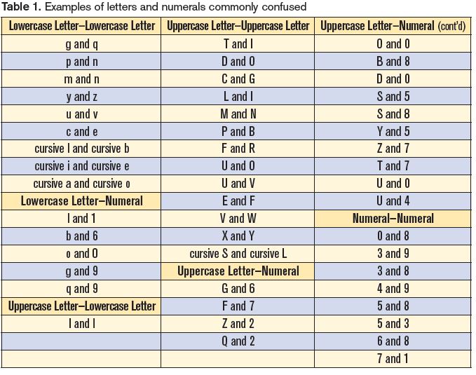
Lowercase letter l mistaken as numeral 1. A nurse misread an order for 2 mg of AMARYL (glimepiride) as 12 mg (Figure 1).3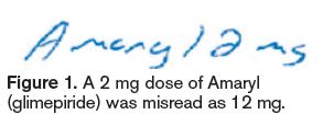 The lowercase l at the end of the brand name, along with insufficient space between the last letter of the drug name and the dose, led the nurse to misread the dose as 12 mg. The pharmacist processed the order correctly as 2 mg, and the error was detected when the nurse called to question why only 2 mg was dispensed.
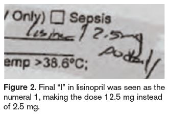
In another case, a nurse transcribed an order for lisinopril 2.5 mg daily by copying the prescriber’s orders that were previously on hold. However, she misread the dose as 12.5 mg daily (Figure 2), seeing the final “l” in lisinopril as the number one (1). The patient received several incorrect doses and developed hypotension, which required monitoring. Similar dosing errors have occurred with other drugs with names that end in the letter l (Figure 3 provides another example).4 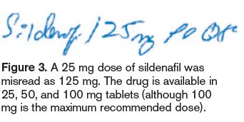
Uppercase letter L mistaken as uppercase letter I. While reviewing an order for a new patient, a pharmacist read “IODINE” in the space for allergies. Another pharmacist thought the allergy was LODINE (etodolac). The pharmacist contacted the patient’s physician who identified Lodine as the allergy.2 The patient was not harmed, but failure to document the correct allergy could have risked serious harm.
Uppercase and lowercase letter U mistaken as numerals 0 or 4. Another common mix-up between alphanumeric letters and numerals involves an uppercase U or lowercase u that has been mistaken as the numeral 0 or 4 if the downward tail on the letter U/u is too long. The handwritten order in Figure 4 was misread as NOVOLOG (insulin aspart) 54 units instead of the intended 5 units. 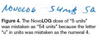 The word “units” had been written out, but the letter u looked like the numeral 4, and the remaining part of the word, “nits,” was read as units. The mistake was made by three practitioners who either dispensed or administered the medication. The patient required treatment for severe hypoglycemia. This error occurred despite the prescriber’s avoidance of the error-prone abbreviation U for units, which has also been misinterpreted as the numeral 4 or 0.
Uppercase letter Z mistaken as numeral 2. A handwritten order for hydrochlorothiazide 50 mg daily was mistaken as hydrocortisone 250 mg. An error-prone abbreviation for hydrochlorothiazide was used—HCTZ—and the dose was written very close to the abbreviation—HCTZ50. In this case, the handwritten letter Z was misread as the numeral 2.
Numeral 0 (written as Ø) mistaken as numeral 4, 9, or 6. A physician documented a handwritten null sign next to a dose prompt for a basal rate on a patient-controlled analgesia order form. Two nurses misread the null sign as the number 4. The patient received a basal infusion of morphine 4 mg/hour and became unresponsive. The patient was found in cardiac arrest; resuscitation efforts ensued but the patient suffered anoxic brain injury. During investigation of the event, several other orders with a null sign revealed that the symbol could be mistaken as a 4 or 9, especially if the tail of the slash mark through the circle is long, or a 6, especially if the circle is not closed above the slash mark through the circle.
Uppercase letter S mistaken as uppercase letter L. A handwritten order for SORIATANE (acitretin) 25 mg was mistaken as LOXITANE (loxapine) 25 mg. The cursive uppercase letters S and L, and the cursive lowercase letters “ri” and “xi,” looked very similar, leading to a potentially harmful error.
Electronic Communication
Electronic medical records, computer-generated or electronic medication administration records (eMARs), and computerized prescriber order entry can help overcome many problems with hand-written communication. Use of such technology has been swiftly growing in hospitals, thanks in large part to meaningful use incentives. However, even typed, computer-generated, or electronic prescriber orders and transcriptions may not prevent confusion among certain alphanumeric symbols. For example, a clearly typed prescription for 25 mcg of LEVOXYL (levothyroxine) could still be misread as 125 mcg if it appears without proper spacing as Levoxyl25 mcg, especially since both strengths are available for this medication.
To cite another example, those familiar with computer-generated passwords know how easy it is to misidentify a lowercase letter l in a password (or email address) as the numeral 1, or the letter O as a numeral 0. Information that contains both numerals and letters—including a medication order—is particularly prone to errors.
Risk Factors Leading to Confusion
The probability of confusing one alphanumeric symbol with another is largely dependent on the number of distinguishing factors between the look-alike pair. The fewer the distinguishing factors, the greater the risk of confusion. For example, the letter O and numeral 0 are at high risk for confusion because there are no discernable factors between them.
It is also more likely for an alphanumeric symbol with more distinguishing factors to be misread as its look-alike counterpart with fewer distinguishing elements.5 Take the number pair of 8 and 3. If the features of these numerals are segmented into rectilinear configurations (like the numbers on digital clocks), the numeral 8 would touch upon all 7 segments, and the numeral 3 would touch upon 5 of the 7 segments (Figure 5). 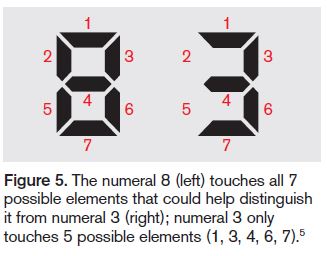 Thus, the numeral 8 would have a greater probability of being misread as the numeral 3, rather than vice versa. The alphanumeric symbol not recognized correctly is more often perceived as one with a simpler configuration.
Context is also a risk factor. While context can sometimes enhance symbol recognition, it can also detract from recognition. For example, if you saw a Z, I, or O amid an array of numerals, you could easily mistake the symbols as the numerals 2, 1, or 0. Also, word recognition software often has difficulty distinguishing L and I, Z and 2, and other look-alike symbols.
Thus, it is not surprising that research conducted by Bell Laboratories found that some alphanumeric symbols are more vulnerable than others to misidentification.1 The symbols l and 1, O and 0, Z and 2, and 1 and 7 accounted for more than half of the errors caused by symbol misidentification in the study.
Safe Practice Recommendations
The characteristics of alphanumeric symbols that form each word or number determine the accuracy and speed at which material may be read or identified. Clarity around the following three characteristics allows readers to focus on the message instead of the mechanics of reading:6
- Visibility: The quality of an alphanumeric symbol that makes it separately discernable from its surroundings.
- Legibility: The attribute of an alphanumeric symbol that makes it possible for each character to be recognized.
- Readability: The quality that makes possible the recognition of the information content of the material.
There are various ways to promote these characteristics in written communications.
Use lowercase or mixed-case letters. Avoid using all uppercase letters. The brain recognizes written words by the shape of the word, or its coastline.7 Coastline refers to the shape of a word formed by the boundaries of its letters. When using all uppercase letters, a word’s shape or coastline is not offered as a visual clue to aid in word recognition.7 While there are several handwritten lowercase letters that are difficult to distinguish (Table 1, above), lowercase letters in general offer more differentiation than uppercase letters. Mixed-case letters (as with capitalizing the first letter of brand names, or using tall man lettering) also provide better distinction among letters. Practically all the text we read is in lowercase or mixed-case letters, so readers are used to that format.7 Words in all uppercase letters may have a small role in use for emphasis.
Print. Encourage prescribers to clearly print handwritten orders, and encourage nurses to use printing when transcribing orders. Practitioners may save time by using cursive writing, but the time saved needs to be weighed against the risk of errors and the tremendous waste of staff time when poorly handwritten orders must be interpreted.
Provide lightly lined order forms. Lines on forms for handwritten orders should be lightly shaded, making them visible to prescribers, yet still light enough to prevent interference with symbols—particularly T, 7, and I, or E, F, and L—when reading handwritten and faxed orders.
Use symbolic differentiation carefully. Symbolic differentiation may be another way to distinctively convey a symbol’s meaning.1 For example, the numeral 7 can be written with a bar through it to prevent confusion with the numeral 1. The letter Z with a bar through it also can prevent confusion with the numeral 2. However, avoid using a symbolic null sign (Ø) in place of the numeral 0, as it’s prone to confusion.
Be selective about font and typeface. Sans Serif fonts are easier to read on computers, although a Roman-style Serif font is easier to read on printed text.7 The Roman-style Serif font (e.g., font) is widely used, very legible, and provides high discrimination between alphanumeric characters. But Serif fonts more elaborate than this style should not be used.6 The preferred font size is about 20-25 minutes of arc, which is equivalent to a 10-14 point font size.6 A study comparing typefaces and font sizes found that, at the 10 point size, Verdana (e.g., font) or Tahoma (e.g., font) was preferred; at the 12 point size, Arial (e.g., font) or Courier (e.g., font) was preferred; and at the 14 point size, Comic Sans (e.g., font) was preferred.7 Times New Roman (e.g., font) and Arial (e.g., font) were read the fastest. Out of all the fonts, Arial (e.g., font) and Courier (e.g., font) were found to be the most legible. (Accurate examples for font size and typeface are in the PDF version of the newsletter.)
Avoid italics and underlining. Italics or underlining should be avoided, as they make it more difficult for the reader to recognize the word shape. However, italics for words or clauses may be used according to publishing guidelines (e.g., Latin terms, journal titles, bacteria nomenclature).
Ensure proper spacing. Allow proper space between the individual letters of a drug name and between the drug name and the dose on all handwritten prescriptions, printed prescriptions and preprinted order sets, and electronic formats such as computer screens, computer-generated medication labels and MARs, printed forms/order sets, and shelf labels. Also provide enough space between each line of text so that tails, loops, and bars of letters do not interfere with the letters in words in lines above and below the text.
Ensure drug and dose make sense. When reading an order, determine if the dose is within a recommended range and available in the strength prescribed. If not, follow-up with the prescriber may be necessary to clarify the order. Keep in mind that the context in which the order is read may not be helpful in all cases to properly identify alphanumeric symbols; however, in the case of medication orders, context may help raise a red flag if the dose seems too high or too low.
References
- Nierenberg GI. Do it right the first time. New York: John Wiley and Sons; 1996:154-62.
- ISMP. Misidentification of alphanumeric characters. ISMP Medication Safety Alert! Community/Ambulatory Care Edition. 2003;2(1):3.
- ISMP. Misidentification of alphanumeric symbols in both handwritten and computer-generated information. ISMP Medication Safety Alert! 2009;14(13):1-2.
- Pennsylvania Patient Safety Authority. What the “l” is the dose? PA PSRS Patient Saf Advis. 2006; 3(3):19-20.
- Keren G, Baggen S. Recognition models of alphanumeric characters. Perception & Psychophysics. 1981;29(3):234-46.
- Kelly MJ. Preliminary Human Factors Guidelines for Traffic Management Centers. Electronic Systems Laboratory, for US Federal Highway Administration;1999.
- Oberoi A. How typography affects readers. Adpushup.com Accessed June 1, 2014.